Design
_edited.png)
_edited.png)

Photo by Sara-Beth Badalamente
I have always had an equal love for STEM and Humanities. Most of my friends and classmates would be especially drawn to one or the other, but I have never been able to choose. I love the technicalities of my STEM classes, and I also feel a deep connection to the beauties of the world. For me, designing has been a perfect cross between the two. I employ my technical brain to make sure that my elements are aligned and that the sizings of photos on a page are right. I also let my creative side take the reigns to break the rules when necessary and add color and life. These two sides of me work in perfect harmony to produce content that not only looks nice but also works well.

Volume 11, Issue 1, Page 1
I had fun combining graphic design with a hard news front page for this story. After laying out the elements for this page, I felt like it could use something more to add some visual interest, so I drew out these Apple apps on my iPad and added them around the girl on the front in order to make it look more appealing.
Volume 10, Issue 6, Page 1
This might be my favorite page I've ever designed. I had a vision for how I wanted this to look before we took the photo, so when the time came, I was able to direct the photographer on where exactly to shoot from and how to get the best lighting. We ended up having the subject of the photo stand on a chair in an upstairs office right next to the small sliver of light coming from a window above a door, and that created this incredible effect that I was then able to incorporate into the design.
I made six different versions of this page before we had the group vote to decide the final one. This is a vital aspect of my design process – trying lots of things until one fits just right.

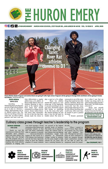
Volume 10, Issue 5, Page 1
This was another front page where I wanted to photo to really pop. I decided to move the headline in between the people and let it "sit" on the track there to draw the eye inwards. I actually had to duplicate the photo, cut the runners out and replace them on top in order for the text wrap to work here, which took a while, but I was pleased with the effect.
Volume 10, Issue 4, Page 1
As you can probably tell, I love designing front pages. This one is simple but effective. I let my photos do most of the talking here and pulled some important stats out at the bottom. I did decide to jump the story to web as that would reach more of the district-wide audience that turns to our coverage for such events.


Volume 10, Issue 4, Page 8-9
I designed this spread last-minute in a couple of hours. We had planned this out and all the stories were ready to go, but for whatever reason, the designers hadn't worked on their design at all until it was time to go. So I sat down and started from scratch. We had this set of events that we wanted to highlight throughout the spread, so I started with those snaking through and then added the features around it. Because it was last minute, there weren't any major drawings involved, but I think the photos and colors stood their ground.
Volume 9, Issue 6, Page 4
This design is pretty standard, but the thing I really like about this is the pull quotes at the bottom. I got photos of each of the women, but I was trying to figure out how to make it look more sleek, and I had this idea of using drawings instead. I asked one of our graphic designers to draw these, and then I placed them along the bottom in a set. I also echoed this repetition of three with stats running down the story to break the text up.


Volume 9, Issue 5, Page 8-9
For this spread about the budget cuts, I knew going in that I wanted the main color here to be this shade of blue as this is the standard color of protest by our teachers – every Wednesday, they wear shirts with this color, and it has become a sort of brand. I collaborated with our then-design editor Anna Lee to come up with this magnet concept, and she drew the people flying towards the magnet. The stat with the bag of money was a last minute addition by the team, and I probably would have reworked it to be a little more cohesive if I had time, but I think the overall effect of the spread is still there. We also decided to include our editorial on the spread, which is unique, but this choice was to incorporate more student perspective.
Yearbook
I've also helped design three yearbook spreads over the past two years. In addition to editing and sending pages, I offered my design work to the Yearbook EICs, and they assigned me a few pages to create. It's been nice dipping my toes back into the yearbook world after I spent so much time in middle school working on the yearbook.
Click on the photos to enlarge them.
.jpg)
Multi-Culti
This spread was about our school's annual multicultural showcase, known as the Multi-Culti. I created this design after seeing the photos that the photographer had taken. I thought it would be nice to continue the idea of the light in the darkness throughout the whole spread. That was where I got the idea for the title as well.
Pep Rally
I designed this spread this year with a few mods related to Homecoming. I enjoyed playing with the overlapping photos and trying out different layouts for each of the elements.
.jpg)


Elections
This was the first high school yearbook spread that I designed. I based it on the spead I designed for the newspaper about national politics and got to use some of my coverage. It's simple but effective, and I loved using my photos for this.
Online
Updated website deck font
At the beginning of this year, after spending the summer away at various camps, I decided that I wanted to include more decks in our articles, particularly on web. I wanted to start with experimenting with my own stories, so I added a subhead for a series of features I did about people selling at the Farmers Market. When I previewed the article in SNO, the subhead font felt very jarring to me, so I poked around a little and updated the font to match our theme on the rest of the website.
Before:

After:

Since then, more stories that we've posted have begun to include decks.


Two examples of decks we have published since I updated the font.
Social Media Fonts
This year, one of our Social Media Editors-in-Chief changed the theme of our posts considerably, which I appreciated – it was a nice upgrade from the simple standard we'd followed for a while. However, they chose one of the main fonts to be a cursive font that wasn't the most legible. After a few weeks of testing it out, I reached out to them about changing it.


The email I sent to the Social Media EICs.
After this, they switched it to Playfair Display, a much clearer-to-read font.
Before:

After:

Press Freedom Fundraiser
Right before the holidays, we did a joint fundraiser with The Communicator, another newspaper in town, which I talk more about on the Marketing and Audience Engagement page. I designed the Wix website for this on my own. Although the design itself looks relatively simple, it did take a while to adjust and re-adjust elements until the page looked balanced. We also published new pieces over the three weeks of the fundraiser, so each Monday I went in and updated the website.
Scroll through the website to see its design. The social media EICs of both publications also based their posts related to the fundraiser on this theme I created with the same fonts and color scheme to match the website.
Guidelines & Instructing
Indents
Last year, we had found that indents in our print paper had been very inconsistent. We didn't have a proper style guide and most pages were being indented far too much or not at all. So the website editor-in-chief, Ishaan Kamat, and I figured out how to edit the indents within InDesign, and I added it to our body text in all the libraries. Now, our indents are consistent always.
Before:

Now:

Felt Boards
One way I love having people lay out their designs is by using these felt boards we have. There's something really helpful about tangibly blocking out a design in terms of making sure that it has visual interest.
This year, I made sure that we used felt boards when we started our in-depth reporting unit, where small groups work on an in-depth story and design for it, as well.

This is me showing staff writer Yara Al Qahwaji how to block out designs using the felt boards.
Page Dimensions
When we came back to school this summer, our printer had transferred ownership to a new person. Everything was pretty smooth, but when our first issue came back, we noticed that the gutters had been cut off. Previously, we had always included the gutters, so it was noticeably different, but we didn't say anything. After Issue 2, though, the team and I pretty strongly realized we preferred the look with the gutters, so I emailed the new printer to ask if she would be able to help us out at all. She wrote back very kindly, and we were able to get our gutters back for the rest of the year.

A portion of the email I sent to our new printer.

Issue 3 of the newspaper with our white space back!

The image I included in the email, showing our previous gutters compared a new edition without white space.
Middle School
Last year was the first time The Cougar Star printed a physical paper. A major part of that was teaching the middle schoolers how to design pages and, mostly, how to use InDesign. This year, I have been working on expanding the team of designers, as last year it was just a few eighth graders who knew how to design, which makes it difficult to continue every year.
From the beginning of the year, I worked on expanding the middle schoolers' ideas of what page designs could look like.

At our first meeting on Oct. 20, I showed a group of seventh and eighth graders examples of alternative story formats that we have published at the high school level. My goal here was mainly to show them that they can design in a variety of different styles.
I've made it a priority to work with them at each step of the design process to make it smoother towards the end of the design cycle when it is time to copyright.

The designers for their second issue work on their design drafts after I went through a minilesson on design rules with them. After this, I sat with each of them individually to give them feedback on their designs before anything started going into InDesign.
.jpg)
The back page of their second issue
Chinmaya Mission
BV 50 Logo
This year is the 50th year of my Sunday School, Chinmaya Mission Balavihar in North America, and as my grandma was the one who first started it in the US, our center is organizing most of the celebrations for this. I designed the main logo that we are using across the country for this. I created it to match the Chinmaya 75 logo which was also created this year to celebrate 75 years of Chinmaya Mission globally.

This is the logo I designed. I outlined a photo of the founder of Chinmaya Mission, Swami Chinmayananda for the left and on the right I used the Chinmaya Mission official logo for the 0 in 50. The font I used is Barlow Condensed, which is in the official Chinmaya Mission style guide.
Amrit Mahotsav Flyer

.jpg)


I designed this fold-open flyer about the program we are hosting this summer celebrating 50 years of Balavihar in the west as well as 75 years of Chinmaya Mission. This has been sent out to every Chinmaya Mission center in the United States (more than 50!) as well as many internationally (there are 300 centers worldwide). We are inviting people from all over to come celebrate this milestone.
I used the style guides from Central Chinmaya Mission Trust to make this flyer and added my own flair as well.
Based on this flyer, I also designed a horizontal banner that we are using as an advertisement in a few local temples as the program approaches.
.jpg)
Finally, I also designed two 24x60 in posters that we got professionally printed that will be on display at the entrance to the program.

